
Hello there and welcome to March!! This week and the next few are going to be insane busy for me and I predict appearances here will be few and far between. I have two major deadlines line on March 15th. The first is work related with this deadline being my first real push of the year and the second is for my son's elementary school. I committed to donating a quilt to our school auction and I have to have the top pieced by the 15th so I can hand it off to my dear friend Michelle.
She is a crazy talented quilter and is donating the actual quilting for the top that I'm piecing. I am a lucky girl to be surrounded by girlfriends who follow their dreams and Michelle is at the top of that list. She has recently opened up a sewing lounge, Urban Spools, in Dallas where she offers classes, open sew times and yes, she also quilts for others.
So between the two deadlines I've actually put up all my Project Life materials. Insert sad face.
Without further ado, here is week four. Yes, I know I'm behind. Not stressing about it though because this year I'm using a great notebook which eventually I will blog about here :)
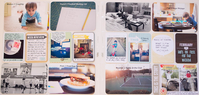
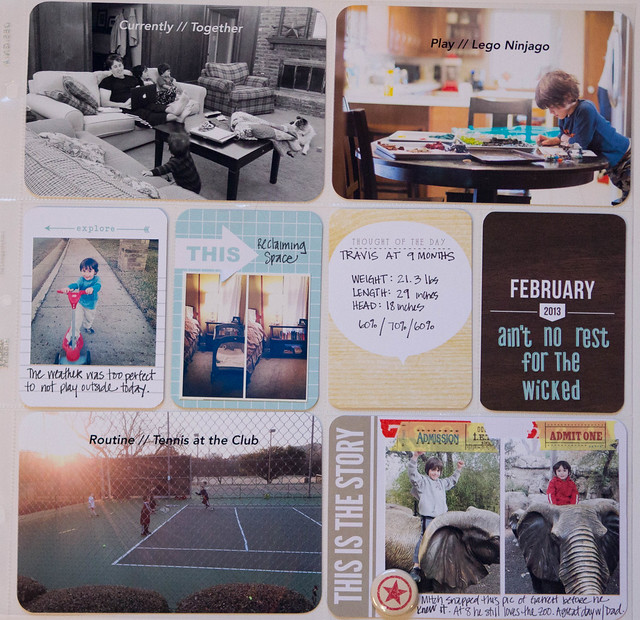
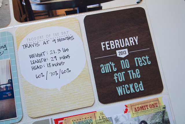
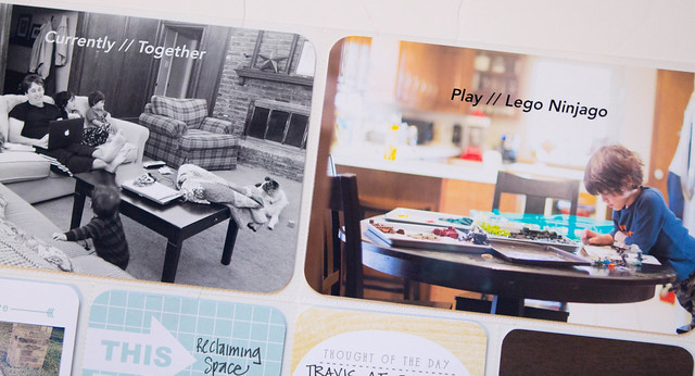
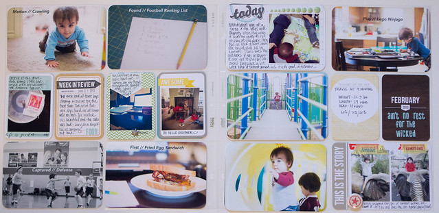
Week Four has a lot of text on pictures. In order for it to be a design element in the overall week I followed a consistent format of Category // Detail.
Kinda loving the way the week in review card disappears into the week. Trying to be better about using my stamps to add just a little something to my 3x4 cards.
I'm struggling a little bit this year with the feeling that there is not enough variety in the kits that I'm using. So I try to be careful to pick 3x4 cards that are a variety of the colors and make sure I don't use too many cards that have the same words repeated. I think it comes down to balance and I end up spending the last 10 minutes I work on a layout shuffling around my 3x4 cards with this in mind.
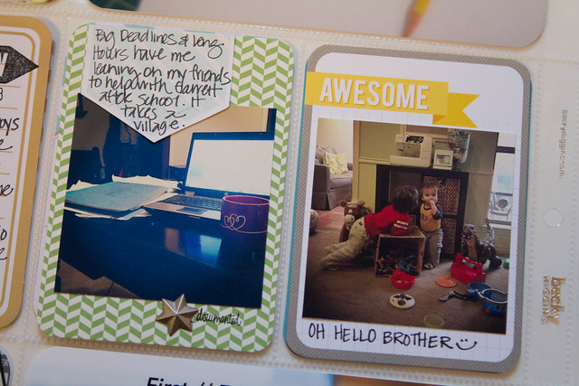
I received a question about how I add text on my 4x6 photos. If I figure out how to capture video of my screen I'll add a post walking you through but until then I wanted to offer this simple tip.
Before I add the text I crop my picture to 4x6 at 300 ppi. Once I do this I don't have any problems with my text being too small on the picture. Generally I like to keep my text size no bigger than 12pt. If you find that when you add text it is too small to see or you are bumping up the size to 72pt, etc to be able to read it your picture file size is likely to large. Cropping it before you add text should solve your problem.
Please note I don't save my pictures at this size. Currently I have a two step process. I am using Lightroom 4 primarily for the editing of my pictures. Lightroom saves your edited version in addition to the original. I LOVE that it does this automatically.
Then I choose to edit in Photoshop where I crop and add a text or digital brush. I do not save this version at all. I've been shooting in RAW and I am simply trying to conserve memory on my laptop. I have not found an instance where I wish I had saved this version.
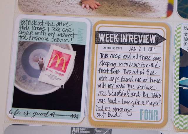
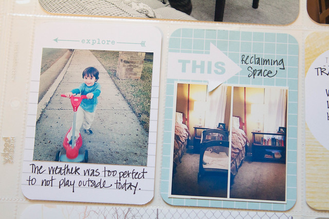
Here is a good example of struggling with too many repeating elements / colors. I love this baby blue but I'm afraid it becomes too much if large blocks are together. With these two cards I made a conscience choice to place these two cards together because the explore card was primarily white with just a hint of the blue.
Another repeated element are arrows, which I love. But I struggle when I look at the layout and find 3 arrows pointing in the same direction. I felt that the arrows going in opposite directions helped break up this repeating element.
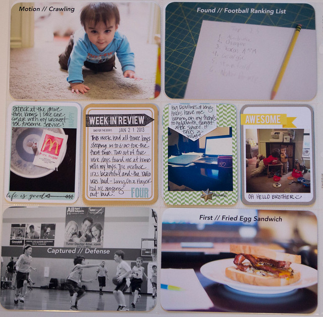
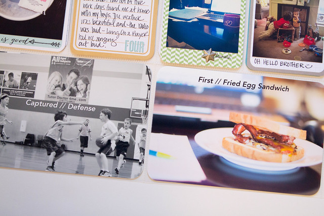
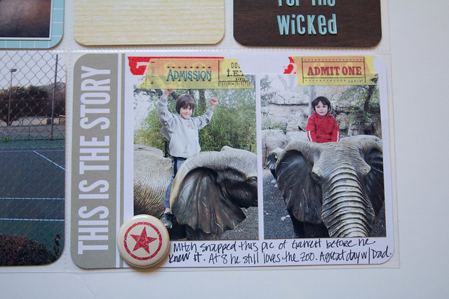
Possibly two of my favorite cards this week.
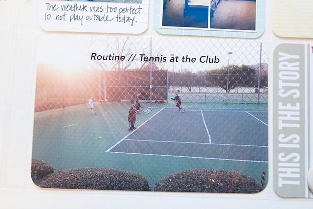
Something new this year is that I'm actually using my iPhone camera as 4x6 pictures and not just for my Instagram pictures. This picture of my son at tennis was an iPhone sneak. We have entered the era of being embarrassed of Mom taking pictures all the time. Sigh.
And a first for 2013, an insert. I'm really working hard on limiting myself on inserts this year because a) it just goes faster that way & I'm short on time 2) I would really like to only have two volumes or gasp maybe even one for this year.
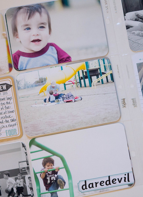
With that said, I had a series of pictures from Travis' first real trip to the playground that I really wanted to include. So, I kept it very simple and only added journaling in one spot and really let the pictures tell the story.
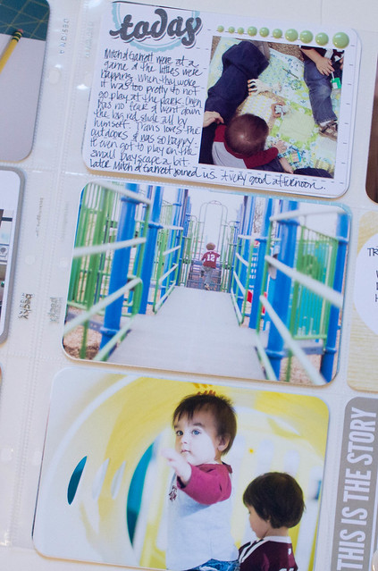
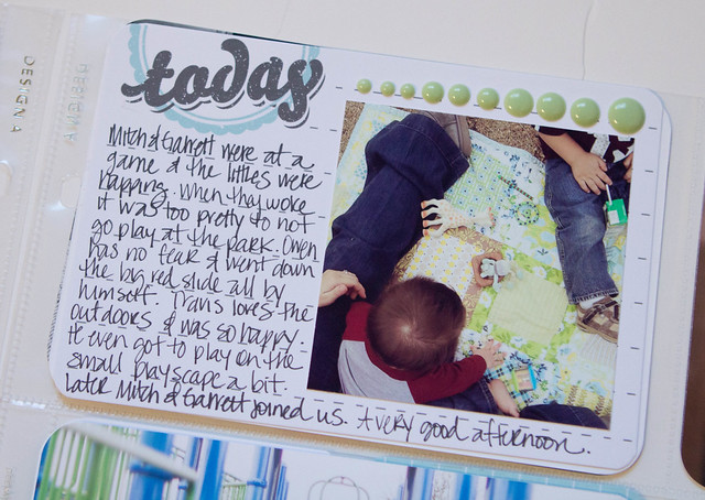
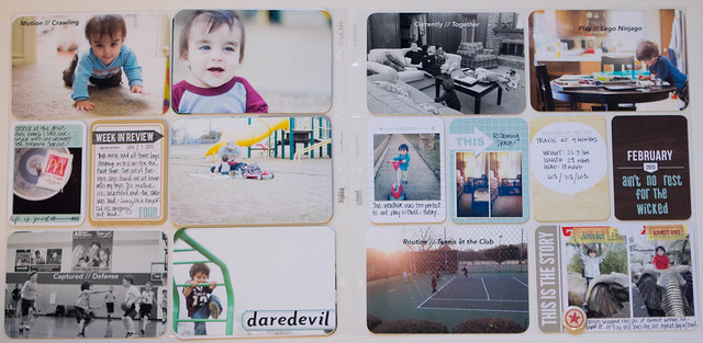
I had to add the daredevil label to Owen's pictures. That kid has no fear. There are a ton of stories I wanted to tell about this playground visit. But I'm hoping that by keeping things simple in my Project Life album this year I'll have more creative energy to tell those longer stories in full layouts. We'll see :)
And that my friends is all I have. I hear the little one stirring so I'm off to get some awesome morning snuggles. Have a wonderful Friday and happy March!!
Monica
Confused by Project Life? Project Life is a back-to-basics approach to memory-keeping created by Becky Higgins. Read more here.


2 comments:
Love seeing your pages Monica. Inspires me to do some pages eventhough I am late starting this year. I also have a 6.5 year old that finds Mummy's constant photography sometimes embarrassing. But also requests photos On occassion i hope seeing the photos printed will help.
I love your Project Life pages. Although I am still stuck on Week 2 for 2013 I am determined to get caught up. Posts like this help so much. Thanks for sharing.
Post a Comment