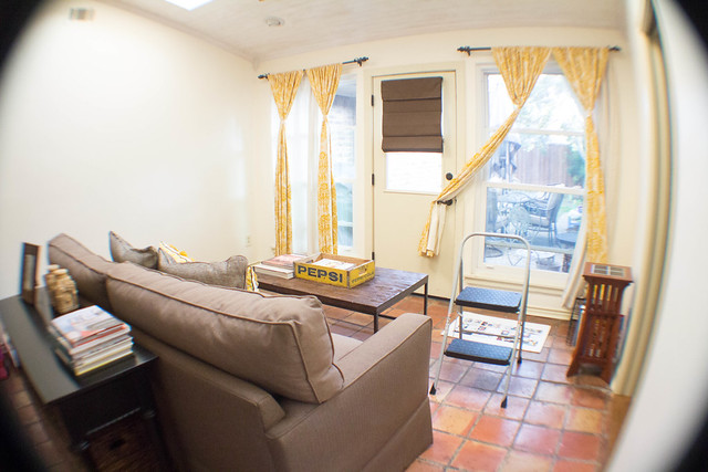
Ali had a great post a few weeks ago about photographing her layouts and it made me think about how I currently photograph my layouts. Over the last three years my process has evolved but I have always photographed them in this room.
The sunroom is in the back of the house and gets a ton of light thanks to the two skylights. Right before Travis was born we renovated this room by removing three sliding doors and closing off a wall. We now have a private master bedroom, an opening to the living room and a pocket door to the playroom. We also added the white washed wood ceiling and its one of my favorite rooms in my house even though I've not finished decorating it. The plan is to create gallery walls of photographs I've taken but to be honest I'm paralyzed by the enormity of the project. So, I enjoy my clean cream walls for now. Moving on....

The first year I photographed my layouts we had these big white chairs, that now live in my dear friends house, that had these great ottomans that were the perfect. I never struggled with color casts because they were on a white backdrop.
The second year I photographed my layouts I layed them on the red tile floor and constantly struggled with color cast. Not to mention there was a good period of time where I was trying to work around a growing Travis in my belly and the photographs were less than stellar.
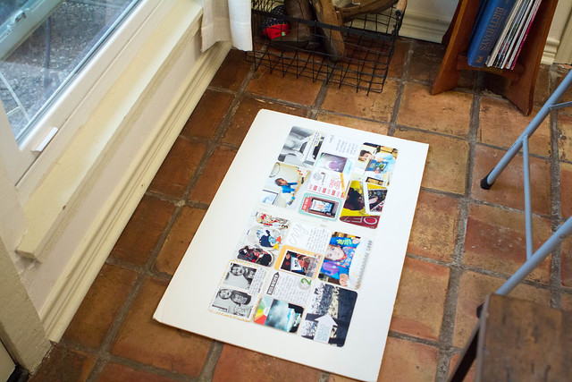
This year I've settled on this corner of the room as the perfect spot for late afternoon photography and have made a few changes.
- I take my layouts out of my binder. In previous years I included several inserts that I had cut down so the layouts wouldn't neccesarily lay flat.
- I am removing my photographs and cards from the page protectors and laying them on top of their spot. This is really working well for me since I don't have to fight the glare anymore.
- I lay everything on a white piece of foam board. This has vastly improved the color cast issues I was having.
- I shoot in manual and tend to over expose when photographing so they can be a bit brighter.
- I do a little bit of post processing in Lightroom to get my pictures ready for the blog. The three things I do are crop out the surroundings, bump up the exposure, and adjust the white balance.
Add in racing home before the light is gone, trying to keep the dogs from running across my layout, or little hands from picking up pictures, or busy feet from climbing the ladder and you pretty much have my process of photographing my Project Life layouts.
If you have any questions just let me know! Thanks for reading.
Monica


6 comments:
GREAT post, Monica! I have a friend who struggles with photographing her physical pages. I'm sending her a link to this. Thanks for sharing!
Terrific to see how someone else photographs their layouts. Thanks Monica.
Thanks for the hints. I am still trying to figure out the best way to photograph my PL. Looks like I need to get some white foam board! (any excuse to go to michaels!)
Thanks for share it. Love your Pepsi wood box!
I'm in love with your sun room. If you hadn't told me about 2 skylights, I would have thought the whole area above it was made of glass. So much light! And with those big windows, I'm sure it's a great place to chill at.
That's the perfect place to take your photographs. I always hear how natural light is always best for taking photos and your sunroom definitely has loads of that. Doesn't it get too hot in there with 2 skylights, though?
Post a Comment